
It started with an impression. Every time I searched for anything, Google answered it itself — an AI Overview at the top, complete enough that there was no reason to click anything.
That impression is worth almost nothing, and it is worth explaining why before I tell you what I found. I had been researching all week. Nearly every search I ran began with how do I or what is — and question-shaped queries have always triggered AI Overviews far more than any other kind. Pew Research Center measured exactly that in March 2025: 60% of searches starting with a question word produced an AI summary, against 8% for one- and two-word searches. [1]
So “AI Overviews are on everything” and “I ask a lot of questions” predict the same experience. My impression could not tell them apart.
So I ran 690 searches to find out which it was.
What I did
540 searches signed in to a Google account, plus a 150-query subset repeated signed out. Every query was written, frozen and cryptographically hashed before the first search ran — the hash is published with the data, so the claim that nothing was cherry-picked afterwards is checkable rather than promised.
The queries were sorted into eleven groups by shape: one-word searches, questions, full sentences, brand names, brand names with a modifier attached, shopping queries, and so on. The same underlying nouns were pushed through each shape mechanically — dishwasher, then how does a dishwasher work, then dishwasher price. So when the groups behave differently, the difference is the shape, not the topic.
This is one person, one location, one machine, over one night. It is a snapshot, not a panel study. Pew's research is better designed than mine in every respect but one: theirs is seventeen months old, and mine is from last night.
The rule
Here is the cleanest result, and it needs no statistics to see.
I searched fifteen brand names on their own. Then I searched the same fifteen brands with a modifier attached — hours, pricing, how to cancel, vs competitors.
0 out of 15. No AI Overview. Just links, the way search has always worked.
54 out of 60 — 90%. An AI Overview, with a conversational box underneath it.
Costco gets you nothing. Costco vs competitors gets you an AI Overview.
Same company. Same fifteen companies. One variable changed, and the result goes from zero to ninety per cent. That is not a correlation — it is a controlled comparison, and it names the rule.
Google is a search engine, and it still behaves like one. If you know exactly what you want, it lists it for you. If you are not sure, it explains. The only correction the data makes to that is whose certainty matters:
When Google can resolve your search to one thing, it takes you there. When it cannot, it explains.
Everything else in the data is that rule seen from a different angle.
It is not quite about whether you know. It is about whether Google can pin your search to a single thing.
The ambiguous single words show this cleanly. apple, amazon, delta and oracle returned nothing — one company dominates each, so Google sends you. mercury, atlas, phoenix and saturn returned overviews. Search mercury meaning the planet and you know exactly what you want; Google cannot tell the planet from the element from the car, so it explains instead. Same certainty on your side, opposite result, because the certainty that decides it is Google’s.
Bare brand names came in at 16% overall, ambiguous single words at 40%.
Meanwhile: questions 97%, long queries 100%, full sentences 100%, yes/no questions 100%. Pool those and it is 158 out of 160 — 98.8% — against 24% for bare brands and ambiguous words. The gap is 74 percentage points, with a confidence interval running from 66 to 81. It is not a subtle effect.
An illustration, outside the tested set. Two searches, four words apart.
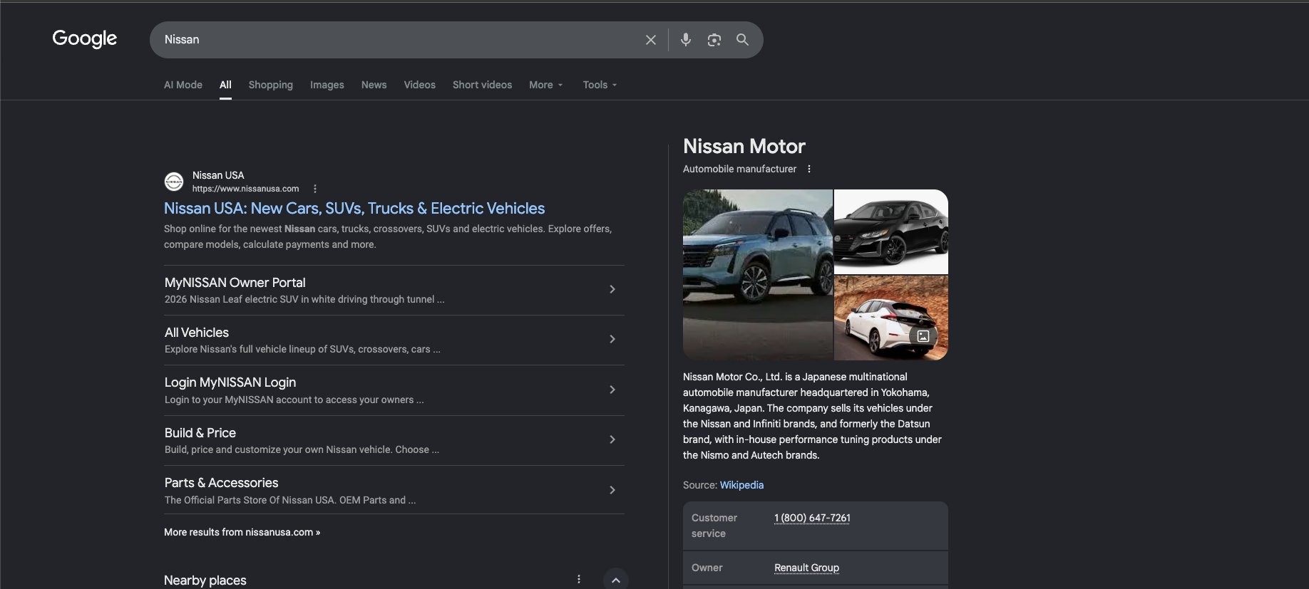
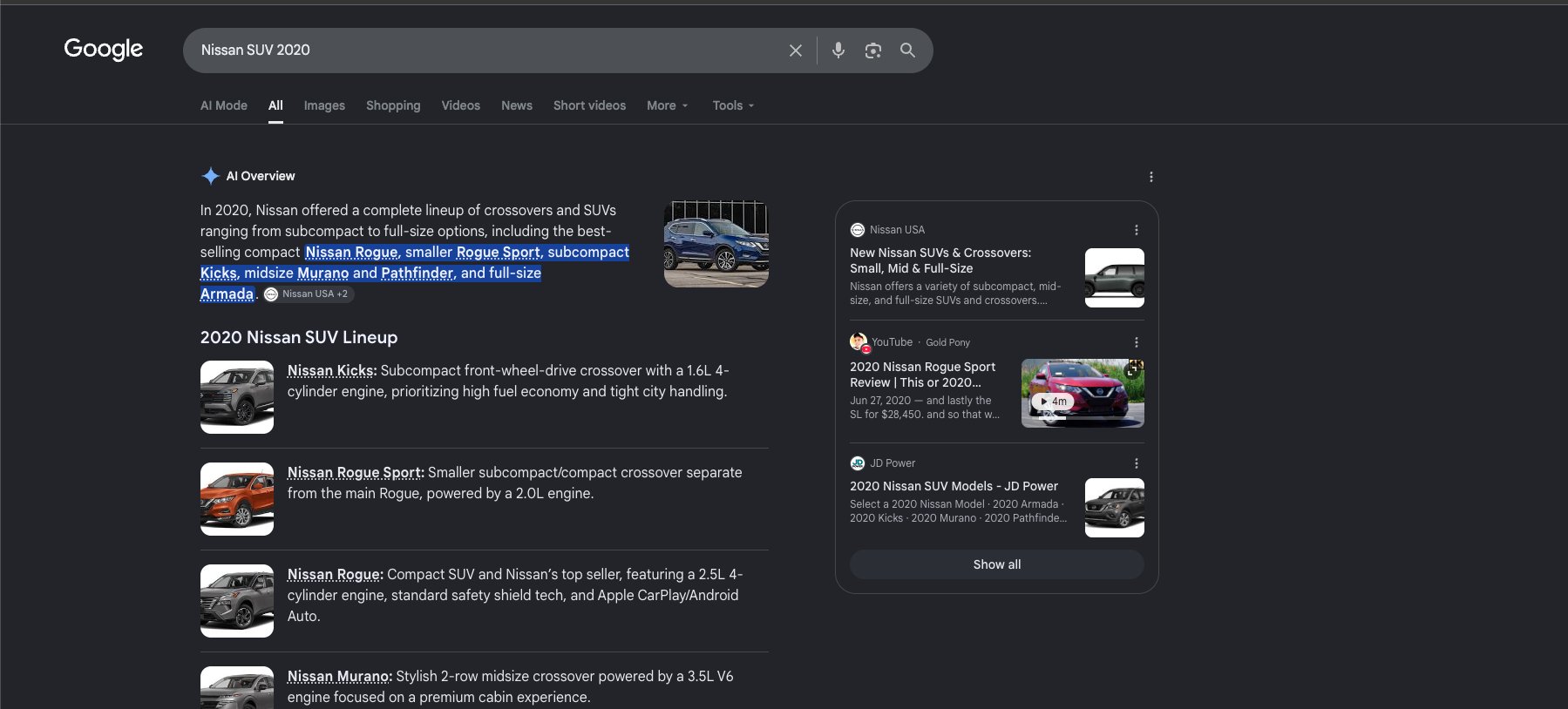
Those two searches were not in the frozen list, so they are not evidence for anything here. They are what the rule looks like when you run into it.
Short searches have changed the most
The single number I would point at is this one.
Whatever else is or is not true, the kind of search that used to almost never produce an AI summary now produces one about two-thirds of the time.
That is where my impression turned out to be right — and right for a reason I had guessed wrong. It is not that everything triggers an overview; brand names still do not. It is that the threshold for “something to explain” has dropped a long way.
Every single overview was a conversation
This is the finding I did not expect, and the one I keep coming back to.
381 AI Overviews signed in. 381 of them carried a free-text box for asking a follow-up. Repeat the subset signed out: 114 of 114. No exception in 495 overviews.
Not a summary with links beneath it. A summary, thumbs up and down, a copy button, and an input box inviting the next question — sitting where the first search result used to be.
Google distinguishes between AI Overviews and AI Mode. AI Mode is a separate tab you have to choose. That distinction is real in the product and, on this evidence, has already stopped meaning much in practice. You do not need the conversational product to be the default if the thing on every results page has quietly become it.
Why I believe the number. 159 of the searches produced no AI Overview at all, and not one of them registered a conversational box. That matters because Google preloads a hidden follow-up component on pages with no overview — a naive check reports it everywhere. The detector was pointed at exactly the case that would break it, and came back clean.
Google says it holds back on sensitive topics. It didn't.
Google has publicly said it aims not to show AI Overviews on many medical, financial, legal and hard-news queries. [2] Sixty searches across those four categories:
- Medical — 14 of 15. Including signs of sepsis, what a blood clot in the leg feels like, warning signs of appendicitis, and a drug-interaction question about ibuprofen alongside blood pressure medication.
- Financial — 14 of 15.
- Legal — 15 of 15. A clean sweep, including what your rights are during a traffic stop.
- Hard news — 13 of 15.
Four searches were withheld, and they are the interesting part: early symptoms of pancreatic cancer, rebuilding credit after bankruptcy, who is winning the election, and the latest hurricane forecast. A cancer diagnosis, a financial crisis, a live election and a live storm.
Those look like deliberate carve-outs, and they are narrow ones. The categories as a whole are not carved out.
What it yields to
When Google does not show an overview, something else takes the space.
Search buy dishwasher and you get a product grid. Search dishwasher near me and you get a map. Search Costco and you get Costco. In each case the overview steps aside for something serving the intent more directly.
The pattern is clean in shopping searches: X price returned an overview 90% of the time, while buy X and X near me returned one only 33% of the time. The exceptions prove it — buy blue whale, buy glacier, buy thunderstorm. You cannot buy those, no product listing matches, so the overview fills the space instead.
So the overview is not only competing with ten blue links. It is competing with everything Google could put in that slot, and it wins whenever Google is unsure what you are trying to do.
What I threw out
This is the part I would want to read in someone else's study, so here it is in mine.
After the analysis was done, I had a second analyst work through the same raw data without seeing any of the conclusions. Same files, no hypotheses, no benchmarks. The instruction was to report what the data showed and, more importantly, what it could not support.
Several findings survived unchanged. Several did not.
Also discarded: page-load timings that measured the stopwatch rather than the page; publication dates pulled by a rule loose enough to read a car insurance policy limit as a date; and a tidy explanation for which brand names trigger overviews that turned out to be circular, because the labels had been applied after seeing which ones did.
Eight detector bugs in total. Every one produced a confident, plausible, wrong number. Every one was caught by looking at a screenshot instead of trusting the code.
What this means if you have a website
- Know which shape your traffic arrives in. If people find you by typing your name, you are largely unaffected — brand queries still return links. If they find you by asking a question you have written an answer to, you are in the 98%.
- “Something to explain” is the thing being commoditised. The overview appears precisely where your explanation would have been the reason to click. Being the best available explainer of a general topic now competes with a summary of every explainer, presented above it.
- What cannot be summarised is what you measured yourself. An overview synthesises what is already out there. It cannot reproduce a number you generated, a result contradicting the consensus it is built from, or something that happened to you.
Google shows an AI Overview when it believes there is something to explain. The same fifteen brand names returned nothing on their own and an overview 90% of the time with four words added. That rule has not changed. What has changed is where the threshold sits — one- and two-word searches went from 8% to 66% in seventeen months.
And every overview in 690 searches carried a box inviting the next question. Whatever Google says about which product is the default, the summary on the ordinary results page has already become the conversational one.
All of the data is published, including the parts that did not survive checking. [3] If it does not replicate on your account, in your country, I would like to know.
Sources & Data
Method, in full. 540 queries signed in and 150 repeated signed out, run 16–17 August 2026 from one desktop machine in Florida, in a real Chrome profile, paced by hand. Queries were generated by a deterministic script, frozen and hashed at 00:41 EDT before the first search. Eleven strata by query shape, with the same nouns cycled through each shape. Proportions use Wilson intervals; the paired signed-in/signed-out comparison uses an exact McNemar test. A second analyst replicated the analysis from the raw files without access to any conclusion.
Known limits. One operator, one location, one session, desktop only. AI Overviews are personalised, so this measures one Google rather than Google. The overall rate across all 540 queries is deliberately not reported as a coverage figure — sampling query shapes evenly is not sampling real behaviour, and it would not be comparable to Pew's 18%.